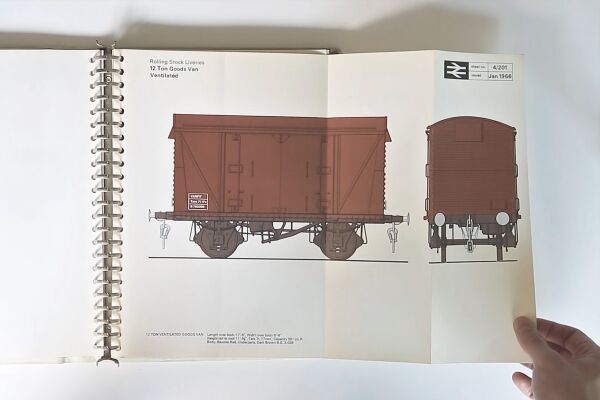
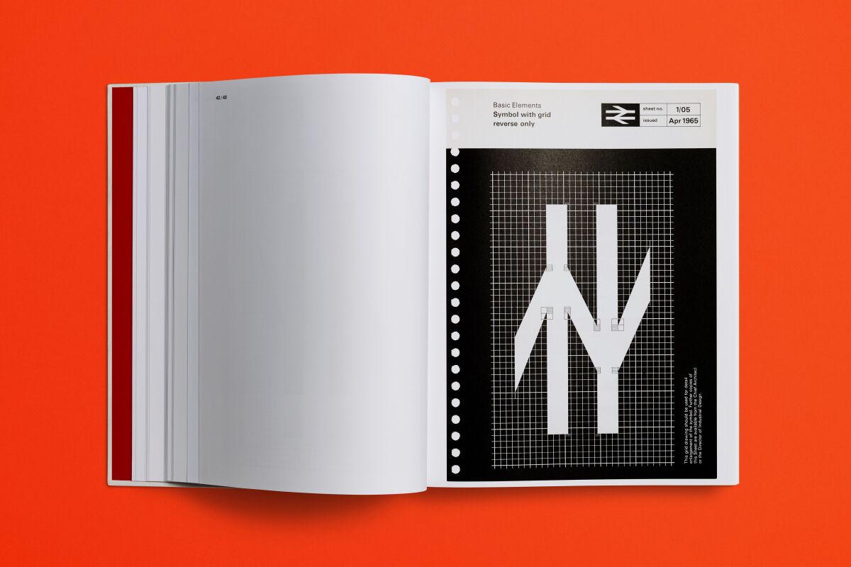
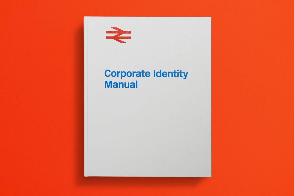
British Rail Corporate Identity Manual
Information
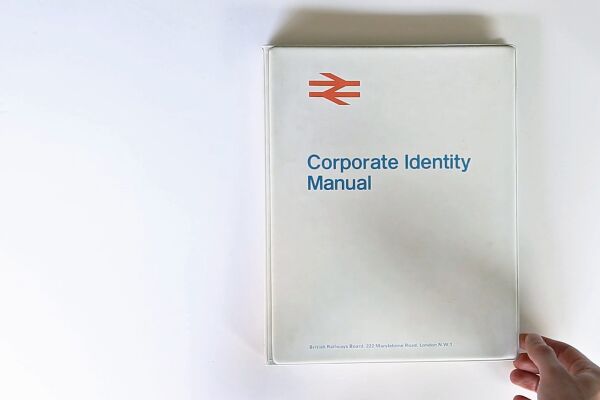
I consulted on this project to publish a high specification reproduction of the 1965 British Rail Corporate Identity Manual, originally designed by Angela Reeves of Design Research Unit. I oversaw creation of the crowdfunding campaign, advised on financial modelling and production, and cleared rights for the book with Department of Transport. The project, initiated by graphic designer Wallace Henning, raised £55,000 via Kickstarter, exceeding its target by £15,000.
Roles
Design
Wallace Henning
Client
Henning Limited
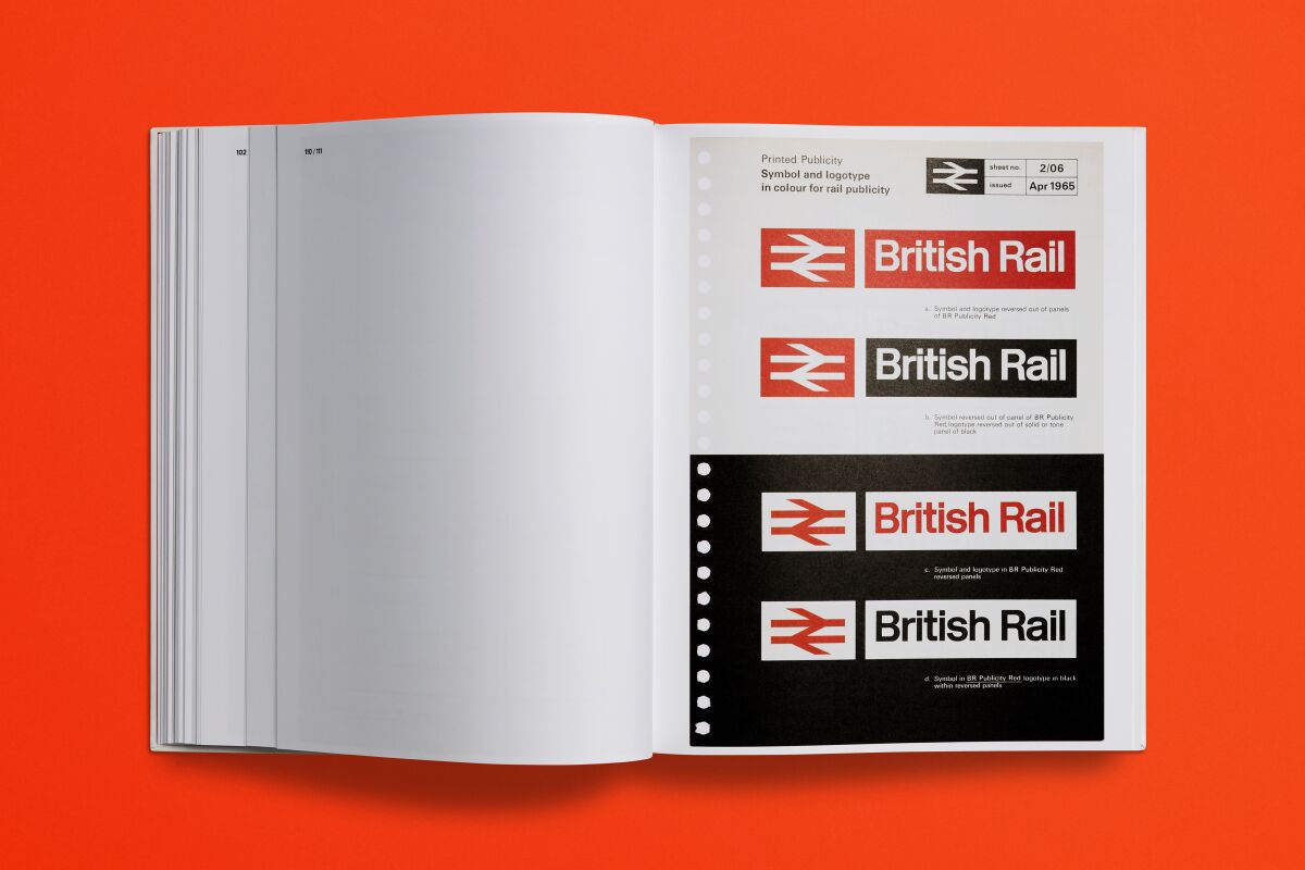
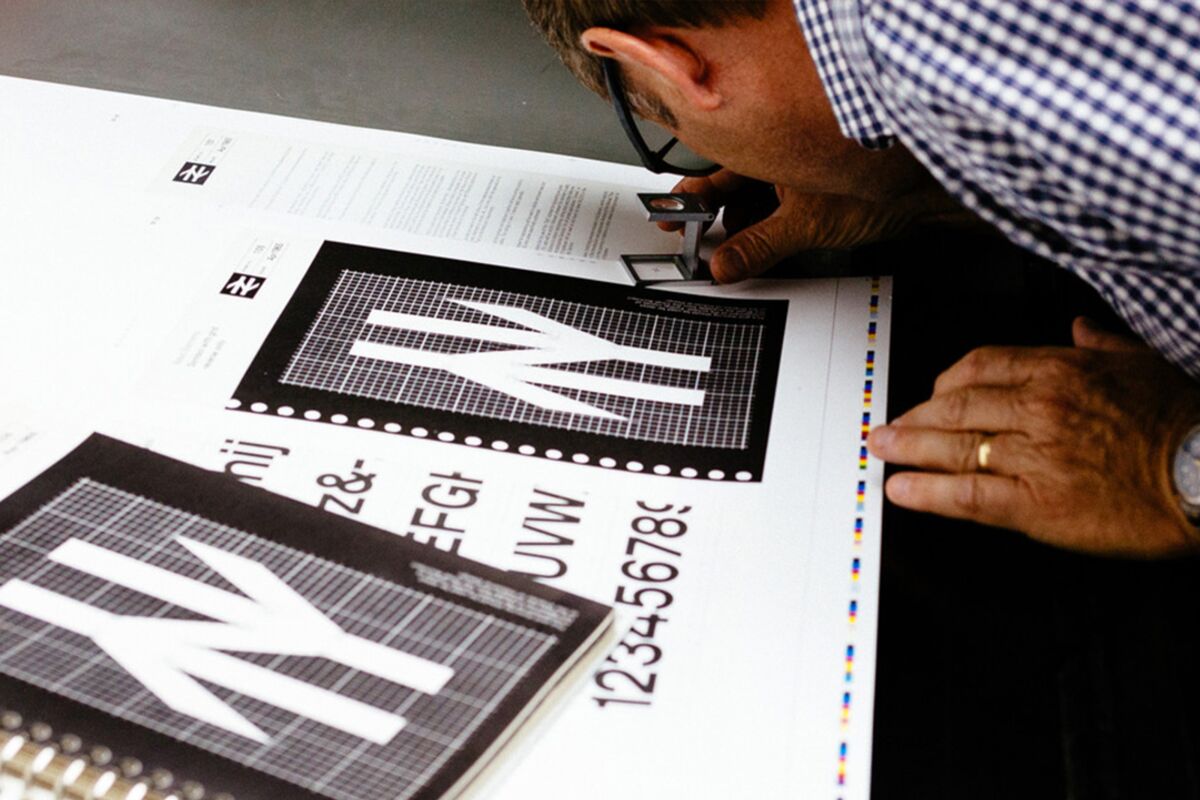
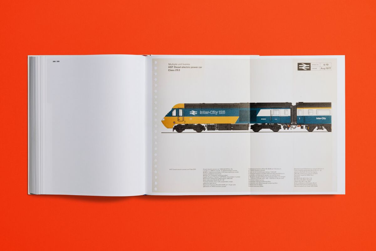
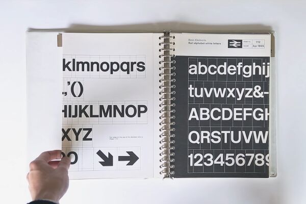
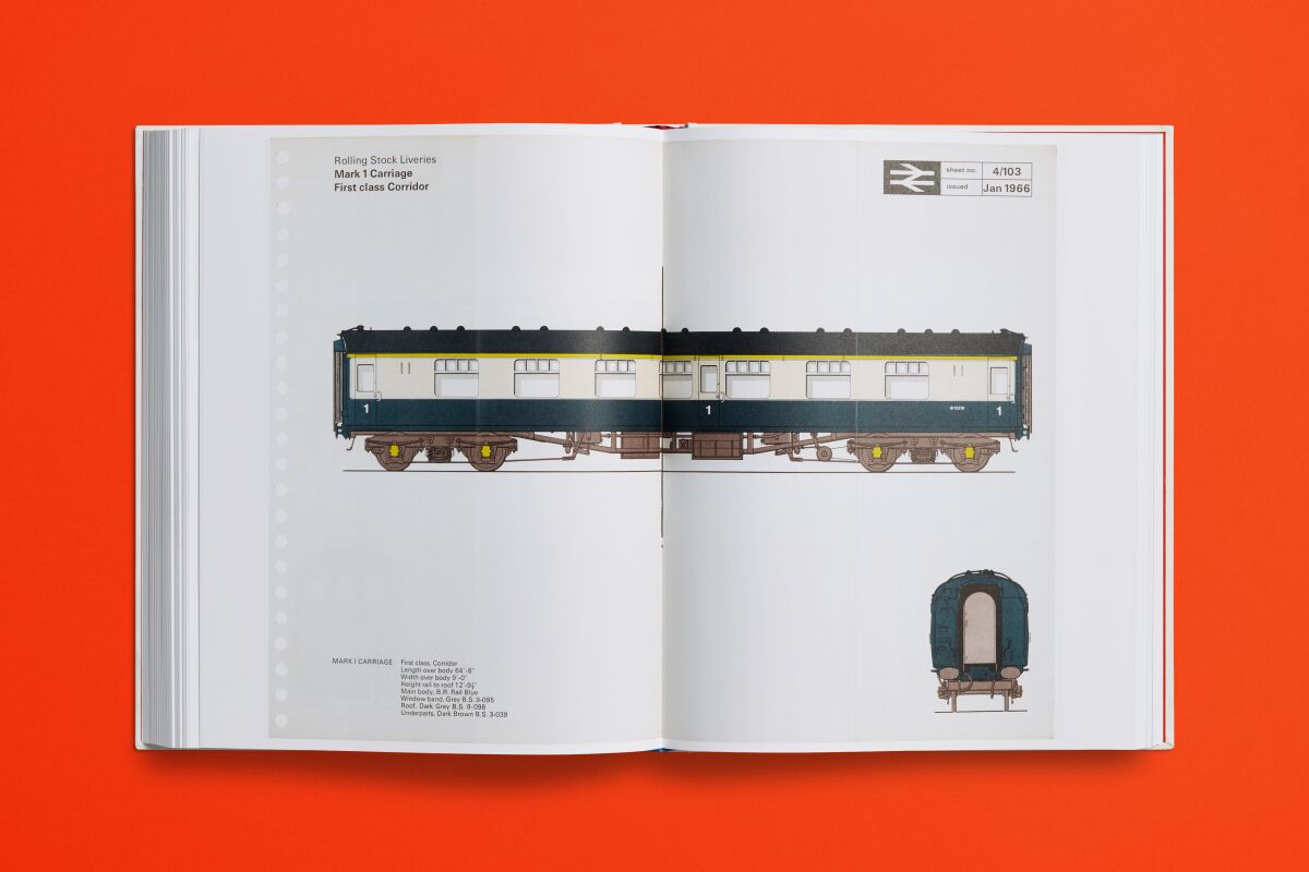
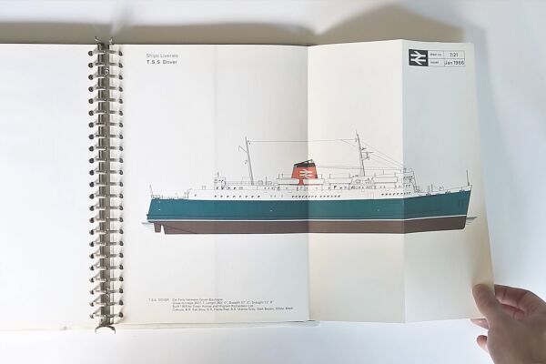
The identity – a touchstone of 20th century graphic design – was created in 1965 to bring a unified and confident look to the newly nationalised British rail network. The original manual was a produced as a ring binder system, detailing how the brand’s components should be utilised, including the bespoke ‘Rail Alphabet’ typeface by Jock Kinnier and Margaret Calvert, and the famous ‘double arrow’ symbol, designed by Gerry Barney.
